Dashboard
Overview
The Dashboard provides a comprehensive view of item predictions and classification predictions. It offers detailed insights into sales forecasts and item categorizations, helping users make informed decisions about inventory management and sales strategies.
The Dashboard is divided into two main sections:
- Items predictions
- Classification predictions
Items predictions
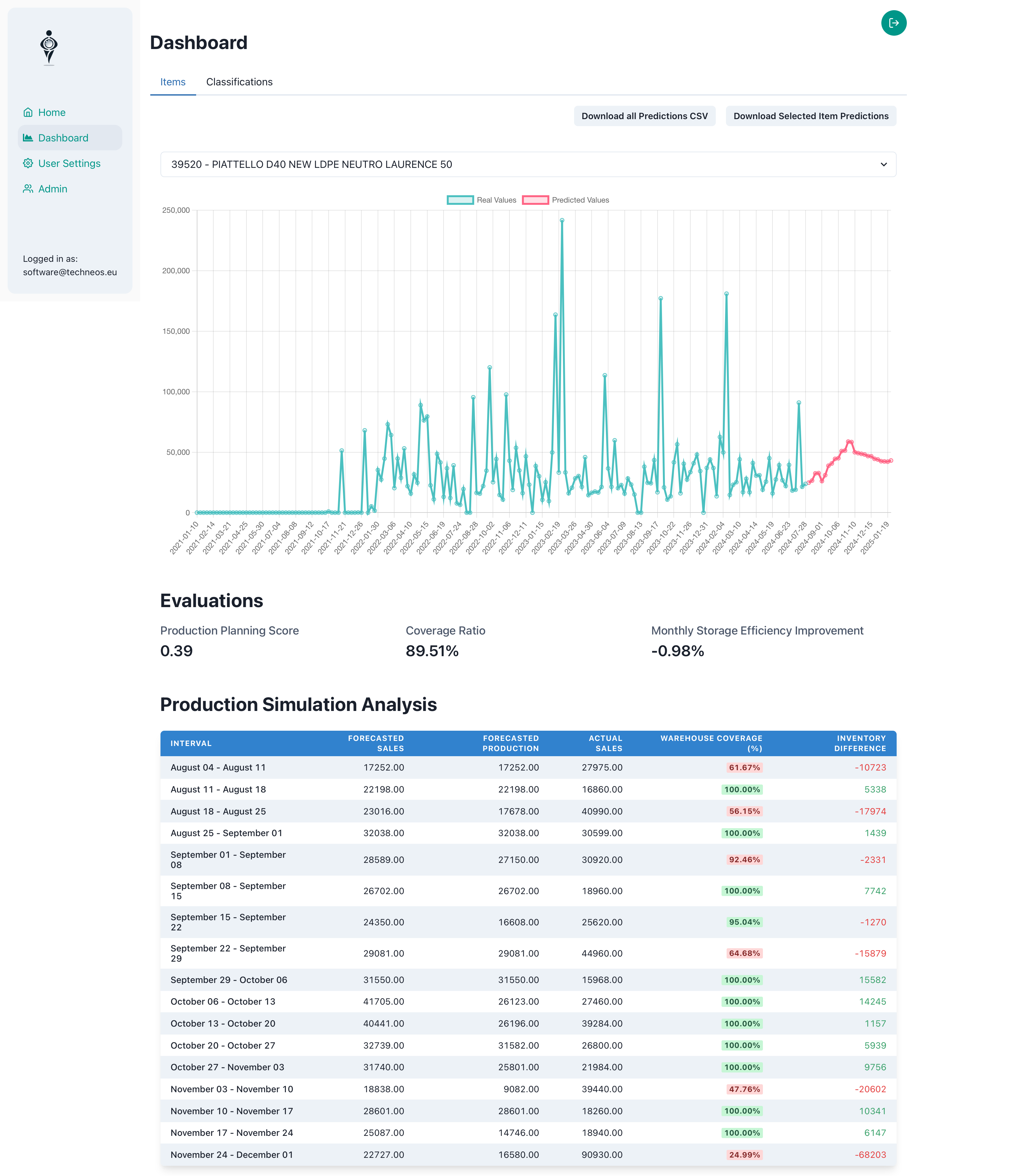
Items Prediction
This section of the dashboard provides detailed predictions for individual items, along with various tools for analysis and data management.
Key Components:
-
Download Buttons:
- Download all Predictions CSV: Download the prediction data for all the top items selected for the analysis in CSV format. The columns are: "ItemCode", "OrderDateTime", "Quantity Predicted", "ItemDescription".
- Download Selected Item Predictions: Download the prediction data for the selected item in CSV format. The columns are: "ItemCode", "OrderDateTime", "Quantity Predicted", "ItemDescription".
-
Item Selection:
- A dropdown menu allows you to select specific items for analysis.
- Items are ordered based on their Production Planning Score, ensuring focus on the most relevant products.
- The output is a list of unique items with their code and description.
-
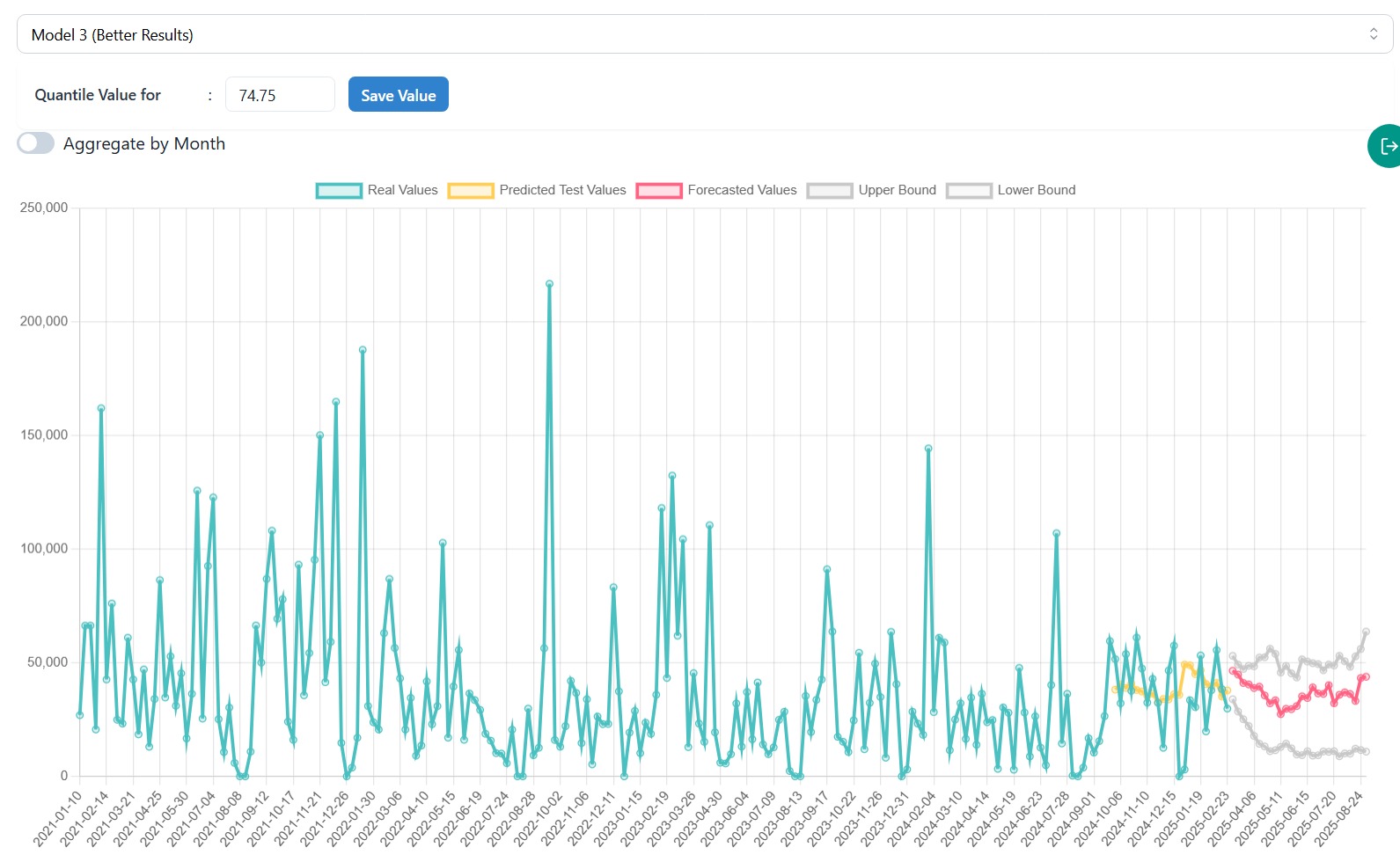
Model Selection:
- Multiple models are used to make predictions, it is possible to observew predictions from different models.
3.1 Quantile Value:
- Available only with Model 3, which offers confidence interval capabilities.
- When Model 3 is selected, a quantile value input appears that lets you adjust confidence levels:
- 50% represents the most likely prediction.
- Higher values (e.g., 98%) show upper-range predictions.
- Lower values (e.g., 2%) show lower-range predictions.
- Changes can be saved to the database by clicking "Save Value" after changing the quantile value, affecting safety stock calculations and prediction reports for that item.
-
Prediction Chart:
-
Displays historical data in green and sales predictions for the selected item in red over time.
-
Based on the best model selected during the evaluation process.
-
Interactive zoom feature: Drag to select a specific time range or pinch to zoom in/out for detailed view.
4.1. Aggregate by Month: The predictions can be observed either in weekly format or monthly format with this option.
4.2. Confidence Intervals:
The prediction chart includes "Upper Bound" and "Lower Bound" lines when using models with this capability. These bounds show the 95% and 10% confidence levels, indicating the range within which predictions are expected to fall. See the example for Model 3 below:
-
-
Evaluation Metrics:
Production Planning Score
The Production Planning Score is a metric used to evaluate the accuracy and efficiency of sales forecasts in the context of production planning. It measures how well the predicted sales align with actual sales, considering both underproduction (potential stockouts) and overproduction (excess inventory).
-
Calculation
The score is calculated using the following steps:
- Calculate the difference between actual sales and predicted sales for each time period.
- Determine underproduction (when predicted < actual) and apply a stockout penalty.
- Determine overproduction (when predicted > actual) and apply an overstock cost.
- Sum the underproduction and overproduction costs.
- Normalize the total cost by dividing it by the sum of actual sales.
-
Interpretation
- The score ranges from 0 to potentially above 1, with 0 representing perfect prediction.
- Lower scores indicate better alignment between predicted and actual sales.
- The score is normalized, allowing comparison across different sales volumes.
-
Parameters
- Stockout penalty (default: 1): Multiplier for underproduction cost.
- Overstock cost (default: 1): Multiplier for overproduction cost.
These parameters can be adjusted to reflect the relative importance of avoiding stockouts versus minimizing excess inventory in your specific business context.
Coverage Ratio
The Coverage Ratio is a metric that compares the sum of predicted sales to the sum of actual sales.
-
Calculation
Coverage Ratio = Sum of Predicted Sales / Sum of Actual Sales
-
Interpretation
- A ratio of 1 indicates perfect prediction overall.
- A ratio > 1 suggests the model is over-predicting in total.
- A ratio < 1 suggests the model is under-predicting in total.
Monthly Storage Efficiency Improvement
This metric assesses the potential improvement in storage efficiency when using the forecast model compared to using actual sales data for inventory management.
-
Calculation
The Monthly Storage Efficiency Improvement is calculated using the following steps:
-
Calculate the actual efficiency:
- Start with an initial stock.
- For each month, compare actual demand with available stock.
- If stock is insufficient, record the stockout amount.
- Update stock by subtracting actual demand and adding forecasted demand.
- Actual efficiency = 1 - (total stockouts / total actual sales)
-
Calculate the forecasted efficiency:
- Start with the same initial stock.
- For each month, compare forecasted demand with available stock.
- If stock is insufficient, record the stockout amount.
- Update stock by subtracting forecasted demand and adding forecasted demand.
- Forecasted efficiency = 1 - (total stockouts / total forecasted sales)
-
Calculate the improvement: Storage Improvement = Forecasted Efficiency - Actual Efficiency
This calculation is typically performed on a monthly basis to provide insights into longer-term storage efficiency trends.
-
-
Interpretation
- Expressed as a percentage.
- A positive value indicates potential improvement in storage efficiency using the forecast model.
- A negative value suggests that using actual sales data might be more efficient for inventory management.
These metrics collectively provide a comprehensive evaluation of the models performance in terms of accuracy, production planning efficiency, and potential improvements in inventory management for each item.
-
-
Cumulative Coverage Graph (%) For Test Data:
- Displays the percentage of how well predictions match actual values over time.
- Shows the cumulative ratio between predicted and actual quantities (predicted ÷ actual × 100%).
- Values around 100% indicate predictions that closely match reality.
- Values above 100% show over-prediction, while values below 100% show under-prediction.
- Updates automatically when different models or quantile values are selected.
- Helps evaluate prediction accuracy and bias trends over longer periods.
This chart is particularly useful for understanding systematic over or under-prediction patterns that might not be apparent in the standard prediction chart.
- Safety Stock Calculator:
- Calculates the required safety stock based on lead time and future demand predictions.
- Shows safety stock recommendations from each prediction model:
- Uses the item's configured lead time (in weeks) to determine the forecasting horizon.
- Sums up weekly predicted demand during the lead time period.
- For Model 3 (Chronos), adjusts predictions using your selected quantile value.
- Displays lead time in weeks and safety stock quantities for all available models.
- Helps inventory planners make data-driven decisions about stock levels to maintain service levels while minimizing overstock.
This feature is particularly valuable for aligning inventory planning with your lead times and selected confidence levels in the forecast.
More info can be found in Safety Stock documentation page.
- Production Simulation Analysis Table: The Production Simulation Analysis Table provides a detailed breakdown of forecasted and actual sales data, along with key metrics for inventory management. Here's an overview of its components:
-
Process
The table is generated through a process that:
- Analyzes data over specific time intervals, typically weekly.
- Calculates various metrics including forecasted sales, actual sales, and warehouse coverage.
- Computes cumulative metrics to offer insights into overall production planning efficiency.
-
Table Columns
The table includes the following columns:
- Interval: The time period for each row, typically a week (e.g., "January 01 - January 07").
- Forecasted Sales: The predicted sales for the interval.
- Forecasted Production: The suggested production amount based on the forecast and current stock.
- Actual Sales: The real sales that occurred during the interval.
- Forecast Accuracy: How close the forecast was to actual sales, calculated as 1 - (|actual - forecast| / forecast).
- Actual-to-Forecast Ratio: The ratio of actual sales to forecasted sales (actual / forecast).
- Warehouse Coverage (%): The percentage of actual sales that could be fulfilled from available stock.
- Inventory Difference: The remaining inventory after fulfilling actual sales (can be positive or negative).
Classification Predictions
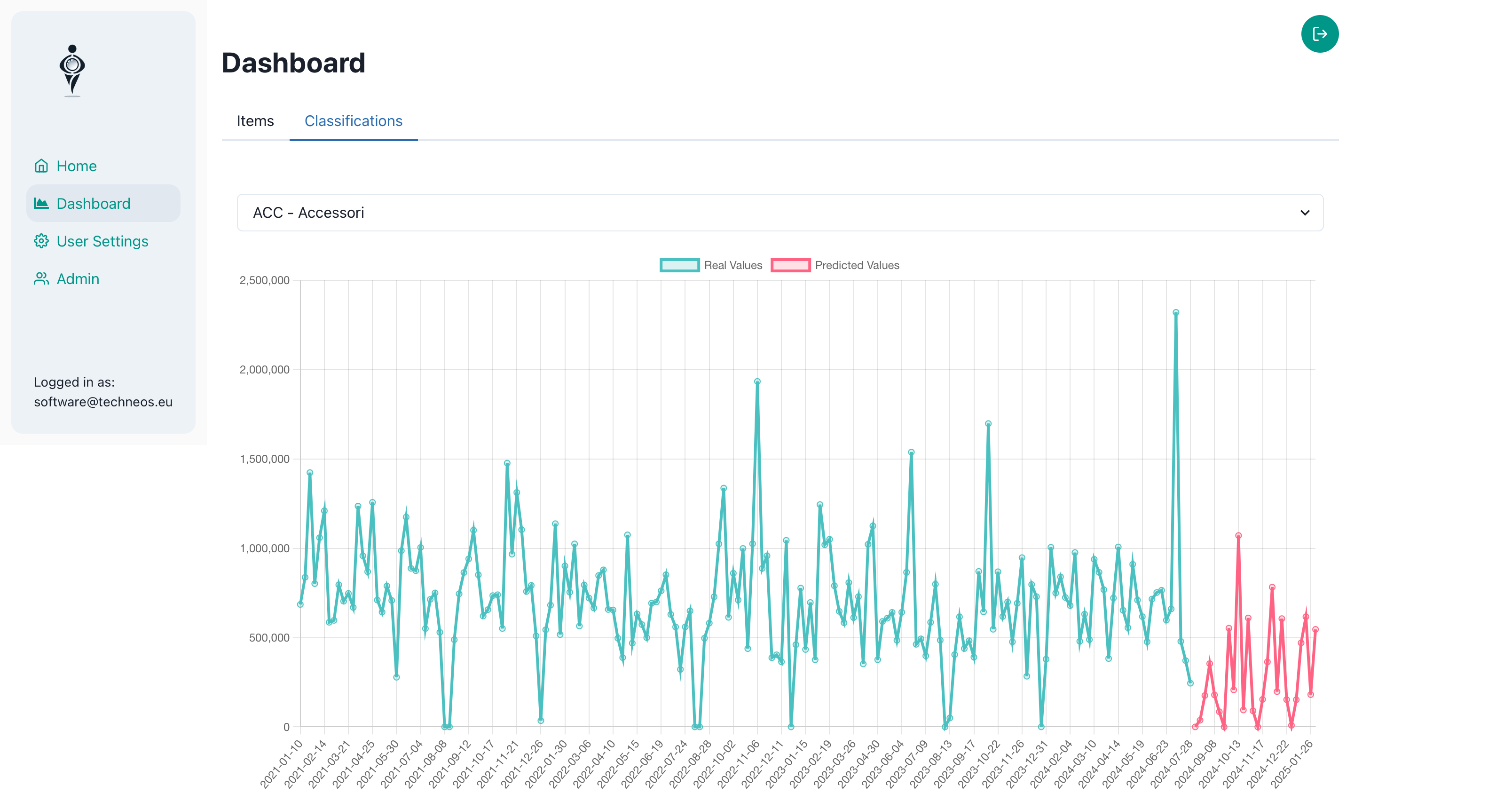
This section provides insights into the categorization of items based on their sales patterns and characteristics.
Key Components:
-
Item Selection:
- A dropdown menu allows you to select specific classification of items for analysis.
- The output is a list of unique classifications with their code and description.
-
Prediction Chart:
- Displays historical data in green and sales predictions for the selected item in red over time.
- Interactive zoom feature: Drag to select a specific time range or pinch to zoom in/out for detailed view.
Conclusion
The Dashboard serves as a central hub for data-driven decision making in inventory and sales management. By providing both item-specific predictions and broader classifications, it enables users to make informed decisions at both micro and macro levels. Regular review and analysis of this dashboard can lead to optimized inventory levels, improved sales strategies, and better overall business performance.